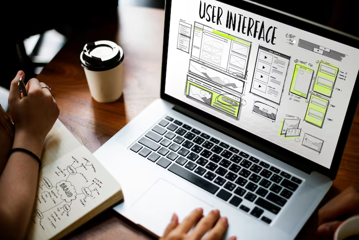
In today’s digital world, your website is often the first impression potential customers have of your business. Whether someone is searching for a local service, browsing products, or comparing companies, they are likely doing it from a smartphone. This shift in user behavior has made having a mobile responsive website more important than ever.
A website that works seamlessly across all devices not only creates a better experience for visitors but also plays a significant role in generating more leads and increasing conversions. Businesses investing in professional web design services in Winnipeg are seeing higher engagement, improved search rankings, and better customer satisfaction because their websites are designed with mobile users in mind.
If your website is difficult to navigate on a phone or tablet, visitors are likely to leave before taking any action. A responsive website ensures every visitor enjoys a smooth browsing experience, regardless of the device they use.
What Is a Mobile Responsive Website?
A mobile responsive website automatically adjusts its layout, images, text, and navigation based on the screen size of the device being used.
Instead of creating separate desktop and mobile websites, responsive design uses flexible layouts that provide a consistent experience across:
- Smartphones
- Tablets
- Laptops
- Desktop computers
Visitors can easily read content, navigate menus, fill out forms, and contact your business without pinching or zooming the screen.
Why Mobile Responsiveness Matters
More than half of all internet traffic now comes from mobile devices. People use their phones to search for products, compare services, read reviews, and make purchasing decisions.
If your website isn’t optimized for mobile users, you risk losing valuable customers to competitors with better online experiences.
Businesses that invest in professional website development in Winnipeg create websites that serve customers wherever they browse.
Better User Experience Means More Leads
User experience directly influences whether visitors become customers.
When someone lands on your website, they should immediately find what they need without frustration.
A responsive website offers:
- Easy navigation
- Fast loading pages
- Readable text
- Clickable buttons
- Properly sized images
- Simple contact forms
When visitors have a positive experience, they stay longer, explore more pages, and are much more likely to contact your business.
Faster Loading Speeds Improve Conversions
Website speed is one of the most important factors affecting user behavior.
Mobile users expect websites to load within seconds. Slow-loading websites increase bounce rates and reduce conversions.
Responsive websites are built with optimized images, efficient coding, and improved performance techniques that help pages load quickly.
Faster websites lead to:
- Lower bounce rates
- More page views
- Higher engagement
- Increased inquiries
- Better sales opportunities
Mobile-Friendly Websites Improve Search Rankings
Google uses mobile-first indexing, meaning it primarily evaluates the mobile version of your website when determining search rankings.
If your website performs poorly on mobile devices, your rankings may suffer.
A responsive website helps improve:
- Mobile usability
- Website speed
- User engagement
- Crawlability
- Overall SEO performance
This makes it easier for potential customers to find your business through search engines.
Responsive Design Builds Customer Trust
A modern, professional website reflects the quality of your business.
When visitors encounter outdated layouts, broken pages, or difficult navigation, they may question your credibility.
Responsive websites demonstrate professionalism by providing:
- Consistent branding
- Modern layouts
- Clean design
- Smooth navigation
- Easy access to information
Trust plays a significant role in purchasing decisions, especially for service-based businesses.
Better Navigation Encourages Visitors to Take Action
Navigation should feel effortless on every device.
Responsive websites simplify menus, organize content effectively, and make important pages easy to find.
Visitors should quickly access:
- Services
- Pricing
- About Us
- Contact information
- Request Quote forms
Reducing the number of clicks required to reach important information increases the likelihood of conversion.
Mobile Contact Forms Generate More Leads
Your contact form is one of the most valuable conversion tools on your website.
If the form is difficult to complete on a smartphone, users may abandon it before submitting.
Responsive websites ensure forms feature:
- Large input fields
- Mobile-friendly keyboards
- Easy-to-click buttons
- Minimal required information
Simple forms encourage more visitors to request consultations, estimates, or additional information.
Click-to-Call Features Increase Inquiries
Many mobile users prefer calling a business rather than filling out forms.
Responsive websites can include click-to-call buttons that instantly connect visitors with your business.
This convenience removes unnecessary steps and encourages immediate communication.
For local businesses, this feature can significantly increase lead generation.
Improved Local Search Performance
Many mobile searches include local intent.
Examples include:
- Web designer near me
- Website developer in Winnipeg
- Local marketing agency
Responsive websites help businesses appear in local search results because they provide a better mobile experience and align with Google’s ranking factors.
Businesses offering web design services Winnipeg can benefit greatly from responsive design by reaching customers actively searching for local solutions.
Responsive Websites Support Digital Marketing
Every digital marketing campaign directs users to your website.
Whether traffic comes from:
- Google Search
- Social media
- Email marketing
- Facebook Ads
- Google Ads
Visitors expect a smooth mobile experience.
A responsive landing page improves campaign performance because users can easily complete desired actions.
Better Social Media Traffic
Social media platforms are primarily accessed through mobile devices.
If someone clicks your website from Facebook or Instagram and encounters a poor mobile experience, they may leave immediately.
Responsive websites help convert social media visitors into customers by delivering a consistent experience across devices.
Higher Conversion Rates
Conversion optimization focuses on making it easier for visitors to become customers.
Responsive websites improve conversions through:
- Clear layouts
- Faster speed
- Mobile-friendly navigation
- Easy forms
- Visible call-to-action buttons
- Improved readability
Small improvements in usability often result in significant increases in lead generation.
Lower Bounce Rates
Bounce rate measures how many visitors leave after viewing only one page.
Poor mobile experiences often cause visitors to leave immediately.
Responsive websites encourage users to:
- Read additional content
- Explore services
- Visit portfolio pages
- Contact your business
Lower bounce rates also send positive signals to search engines.
Easier Website Management
Maintaining one responsive website is much easier than managing separate desktop and mobile versions.
Benefits include:
- Faster updates
- Lower maintenance costs
- Consistent branding
- Simplified content management
- Better long-term scalability
Professional website development Winnipeg services often recommend responsive design because it saves both time and resources.
Responsive Websites Increase Customer Confidence
Customers expect businesses to have professional websites.
When your website functions smoothly on every device, visitors feel more confident in your products and services.
Professional design communicates reliability, attention to detail, and commitment to customer satisfaction.
Future-Proof Your Business
Technology continues to evolve, and new devices enter the market regularly.
Responsive websites adapt more easily to changing screen sizes and browsing habits, helping businesses remain competitive without requiring complete redesigns.
Investing in responsive web design today prepares your business for tomorrow’s customers.
Signs Your Website Needs a Responsive Redesign
If you notice any of these issues, it may be time to update your website:
- Text is difficult to read on phones.
- Users must zoom in to navigate.
- Buttons are too small to tap.
- Images appear distorted.
- Pages load slowly.
- Forms are difficult to complete.
- Bounce rates are increasing.
- Mobile traffic is not converting.
Addressing these problems can significantly improve user experience and lead generation.
Choosing the Right Web Design Partner
Building a responsive website requires more than attractive visuals.
An experienced web design team focuses on:
- Mobile-first design
- Fast loading performance
- SEO best practices
- Conversion optimization
- Secure development
- Ongoing maintenance
Choosing professionals who understand both design and digital marketing ensures your website supports long-term business growth.
Conclusion
A mobile responsive website is no longer optional. It is an essential investment for businesses looking to generate more leads, improve customer experience, and increase online conversions.
From better search visibility and faster loading speeds to improved usability and stronger customer trust, responsive design delivers measurable benefits that directly impact business growth.
Whether you are launching a new website or upgrading an existing one, investing in professional web design services Winnipeg and expert website development Winnipeg from Webgigg can help you create a website that performs exceptionally on every device while turning more visitors into loyal customers.
Ready to Grow Your Business Online?
A professionally designed responsive website can help attract more visitors, improve search visibility, and convert more leads into customers. If you’re looking for reliable web design services Winnipeg or expert website development Winnipeg, contact our team today to create a website that delivers measurable business results.
Frequently Asked Questions
1. What is a mobile responsive website?
A mobile responsive website automatically adjusts its layout and content to fit different screen sizes, providing an optimal experience on smartphones, tablets, and desktops.
2. Why is mobile responsiveness important for SEO?
Google uses mobile-first indexing, meaning it primarily evaluates your website’s mobile version when determining search rankings. A responsive website supports better SEO performance.
3. Does responsive web design improve conversions?
Yes. Responsive websites offer better usability, faster loading times, and easier navigation, making visitors more likely to complete contact forms, make purchases, or request services.
4. How can responsive websites help local businesses?
Responsive websites improve local search visibility, enhance customer experience, and make it easier for mobile users to contact local businesses directly.
5. Should I redesign my existing website?
If your website is difficult to use on mobile devices, loads slowly, or has high bounce rates, a responsive redesign can improve performance and generate more leads.